Article & Photos by Gail K.
As promised, I wanted to share the many blooms we saw. Linda’s recent talk focused on “more than the bloom”  So let’s blend contrasting aspects of bloom & non bloom.
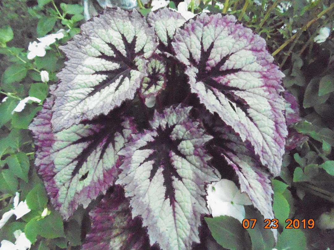
Focus on the elements of design; Texture, color, shape & form. I love blooms and purple so these caught my eye!!
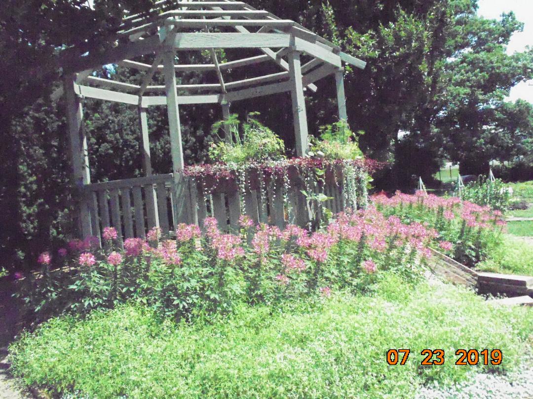
In a partially shaded area, despite being slender, the color- bright fuchsia, drew our eyes up and to the forefront of the dark shaded background;

While contrasting green and white ground cover draws the eye down
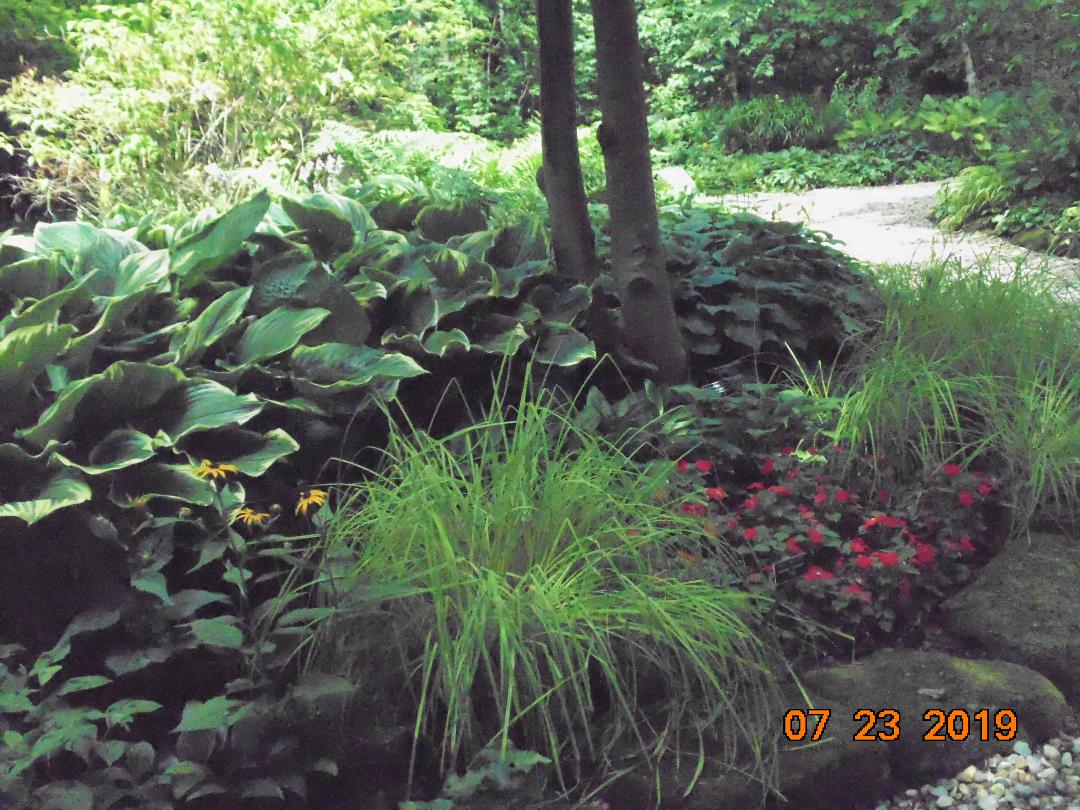
Do you recall Linda speaking of the Kingwood effect when we toured her yard??
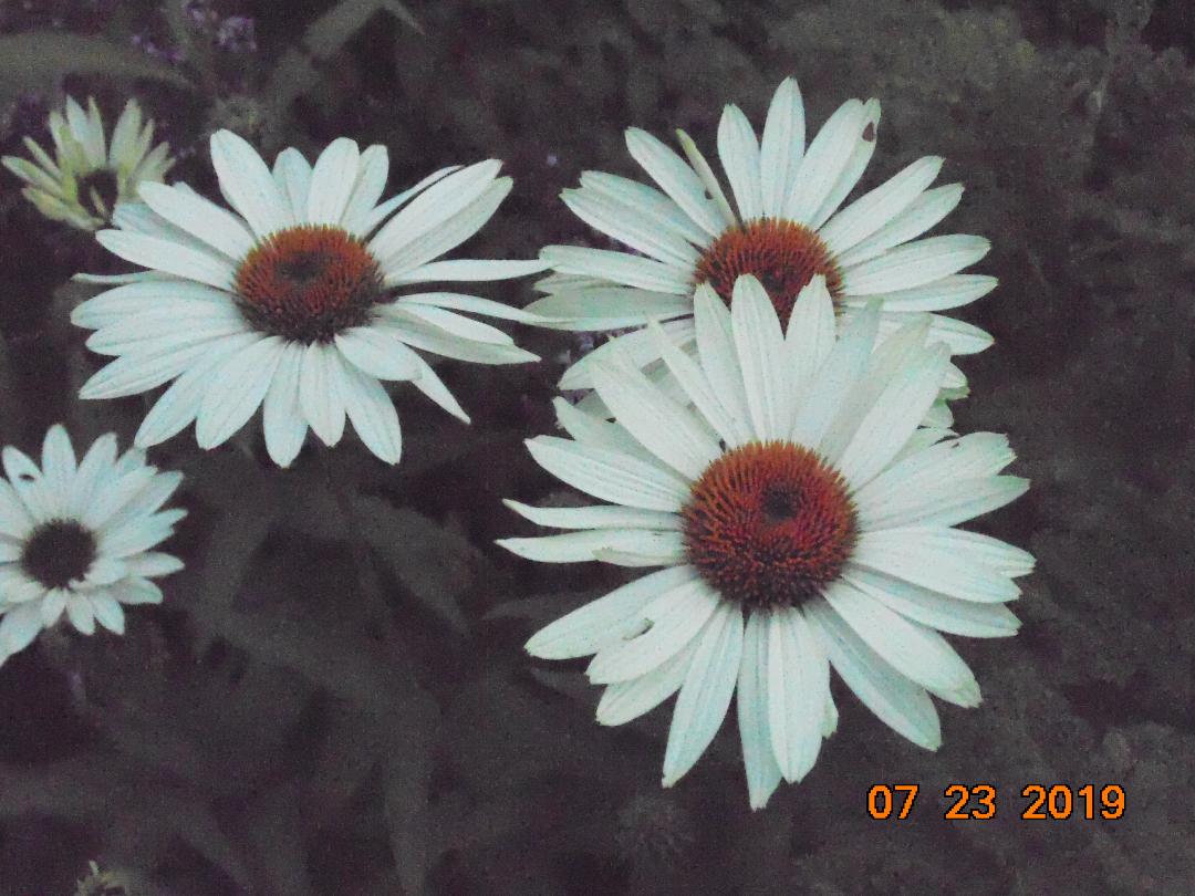
Here it is!! We were both drawn to this display of Coneflowers.
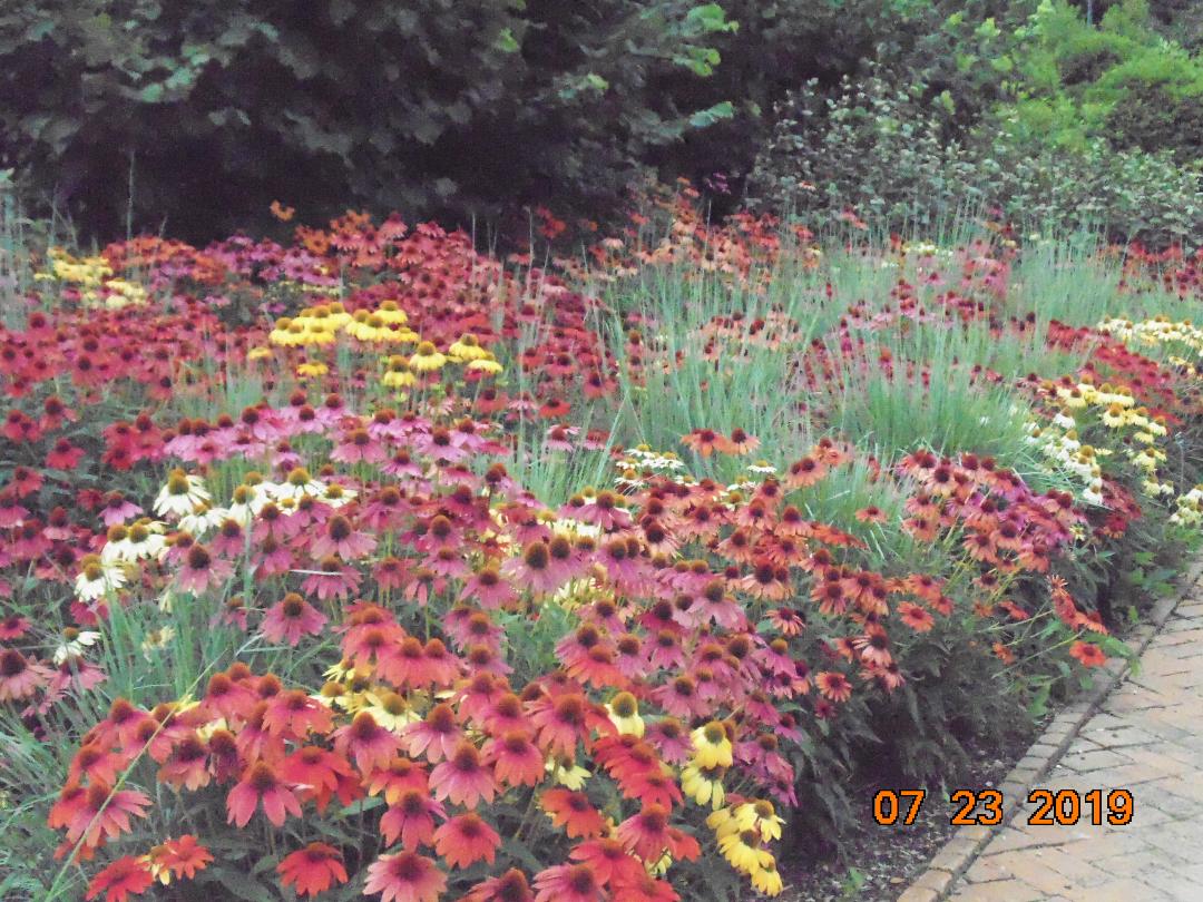
The cool vibrant colors were wild & excited our senses

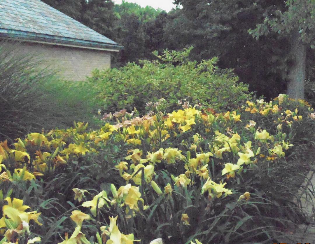
However, the mass grouping of Daylilies had a calming effect; with soft pastel colors of yellow, white
& peach.

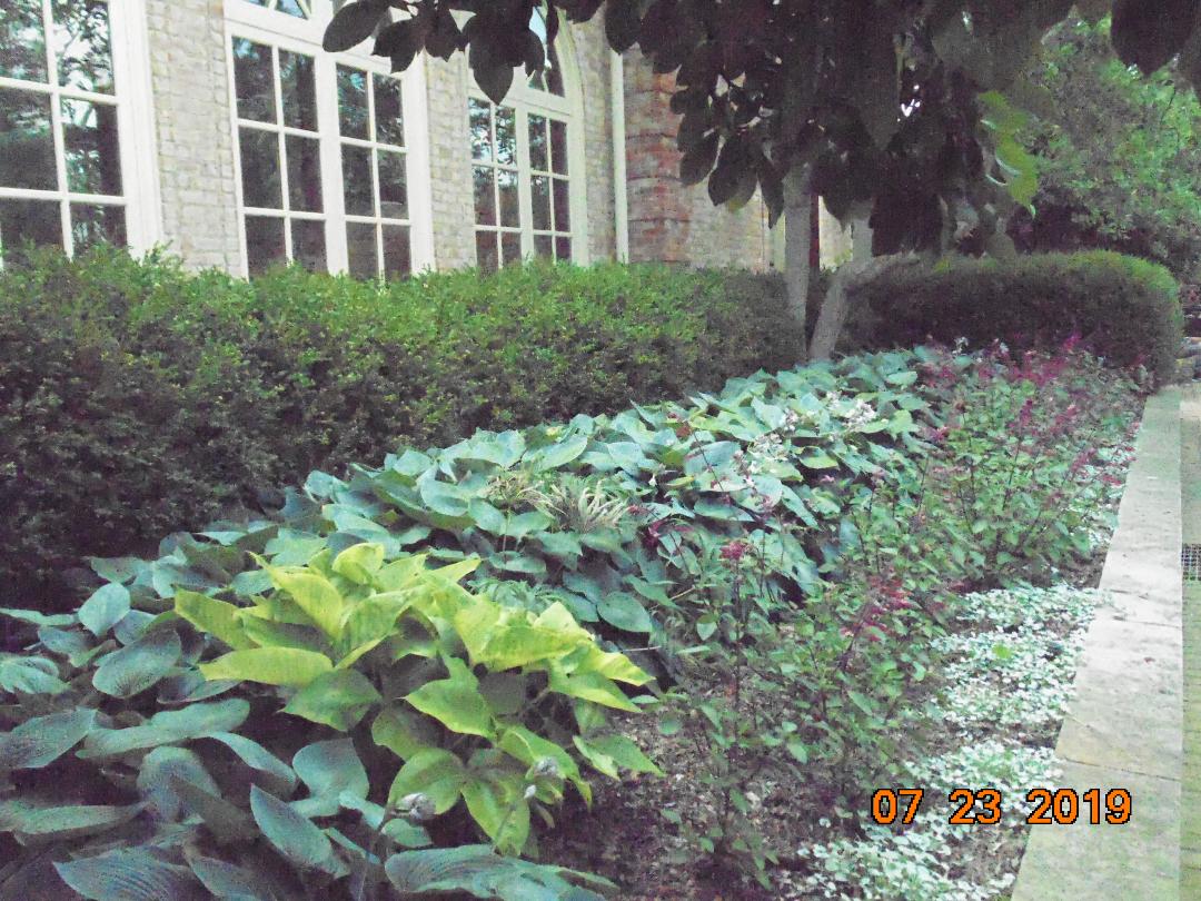
{Note how design makes the building almost disappear}
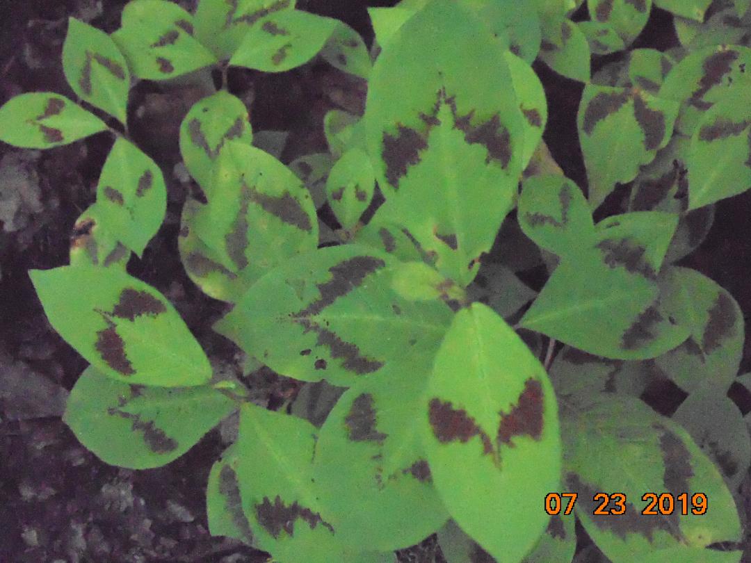
It’s always worth the time to investigate the individual in mass plantings-


Look what we would have missed if we had just walked by-

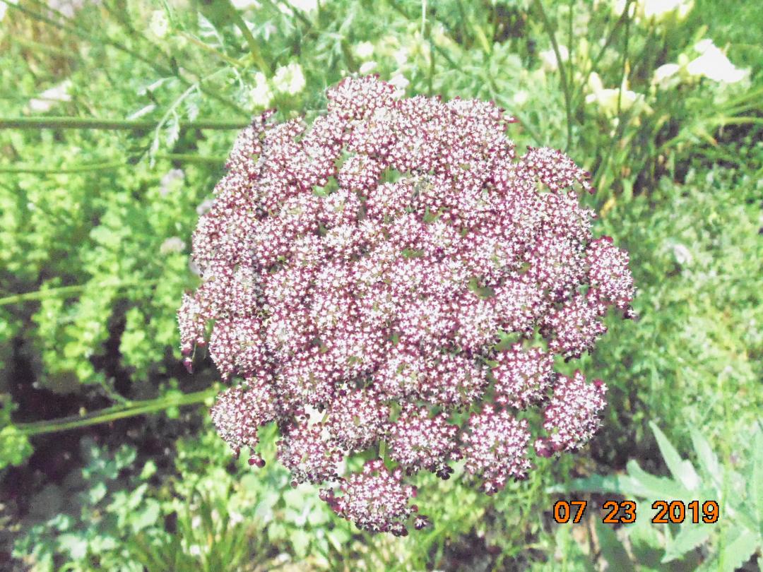
Garlic heads reach up on stiff stalks in defiance of any mid-summer breeze
below:
resembling the graceful queen ann’s lace-as it softly sways to & fro # note to self- find and plant in my yard
ARE WE TRULY-EVER ALONE IN OUR GARDENS???


DO WE WANT TO BE????

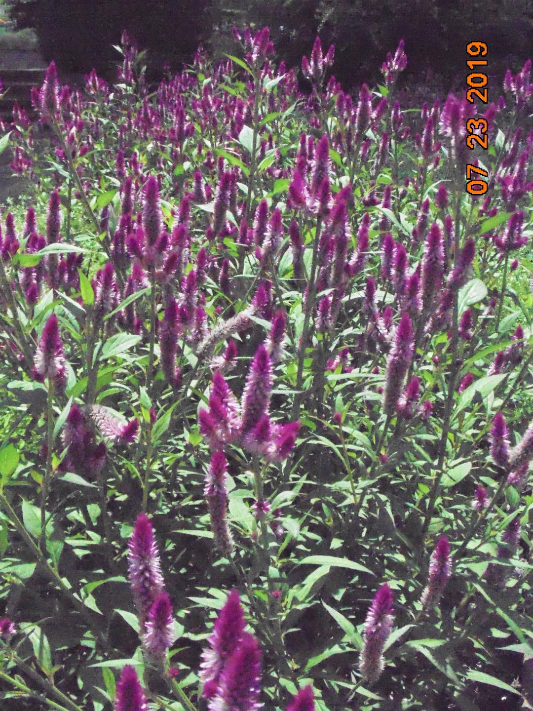
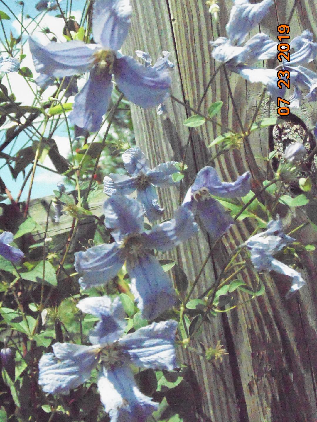
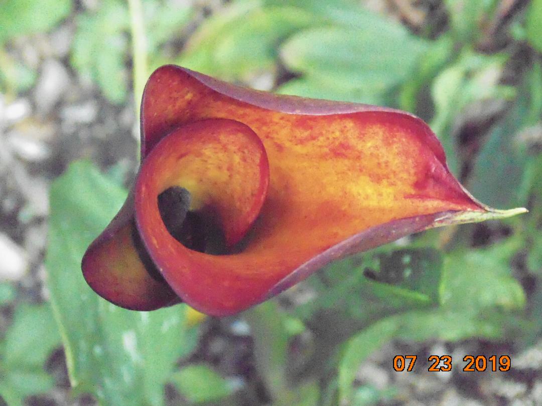
Love Purple–variations of One color; look at all the contrasting in the shape, form & texture
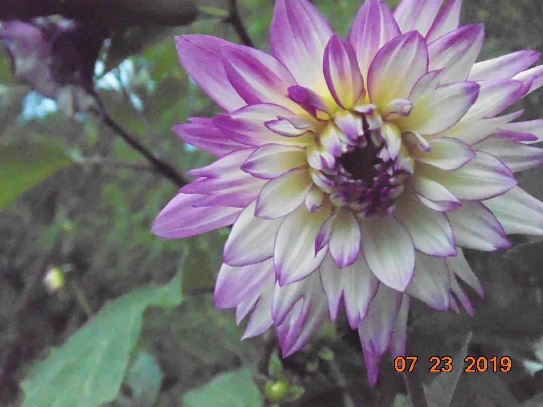


purple or blue???
Matters not to me, I would like to have both in my garden
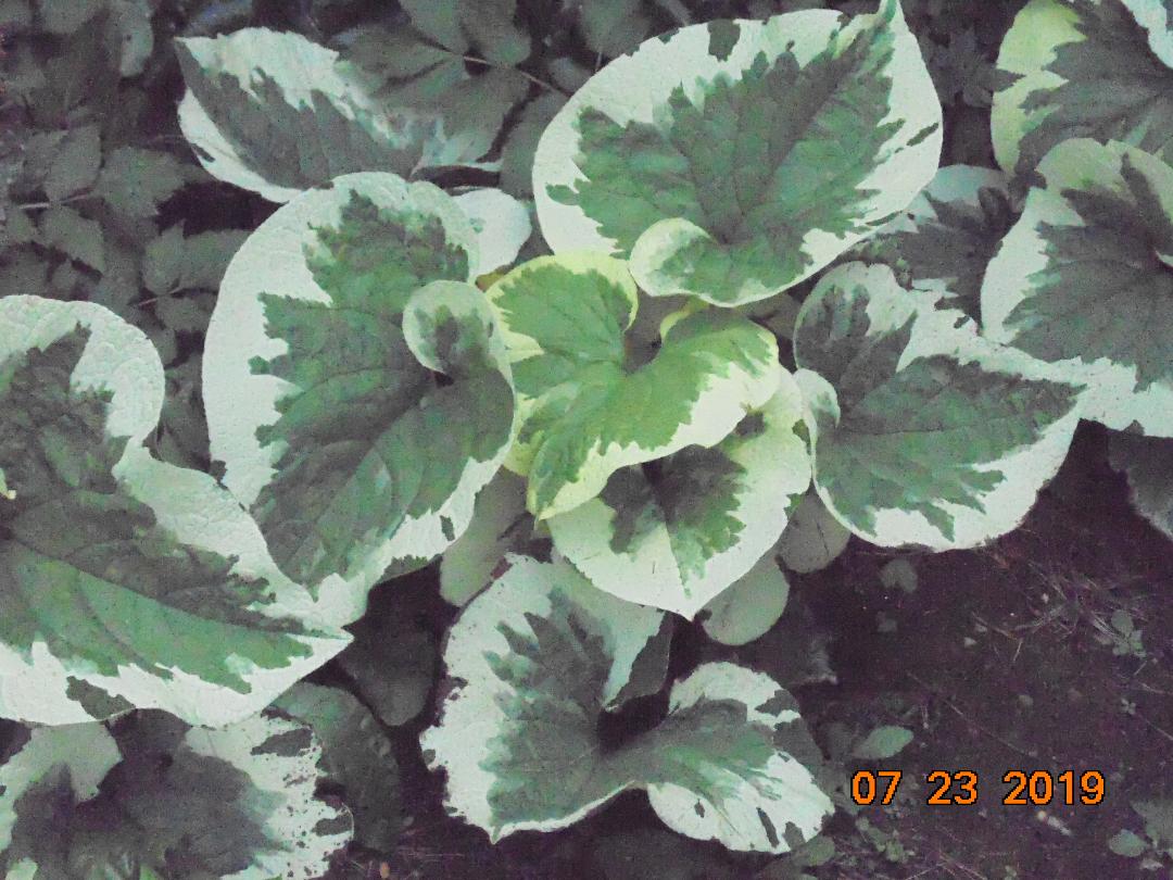
Note the variety of plants & elements of design
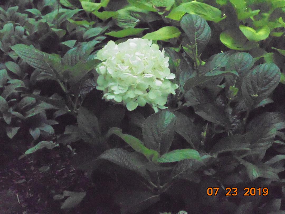
Greens do not have to be “just green” — more than the bloom—
Sharp contrast ahead!!

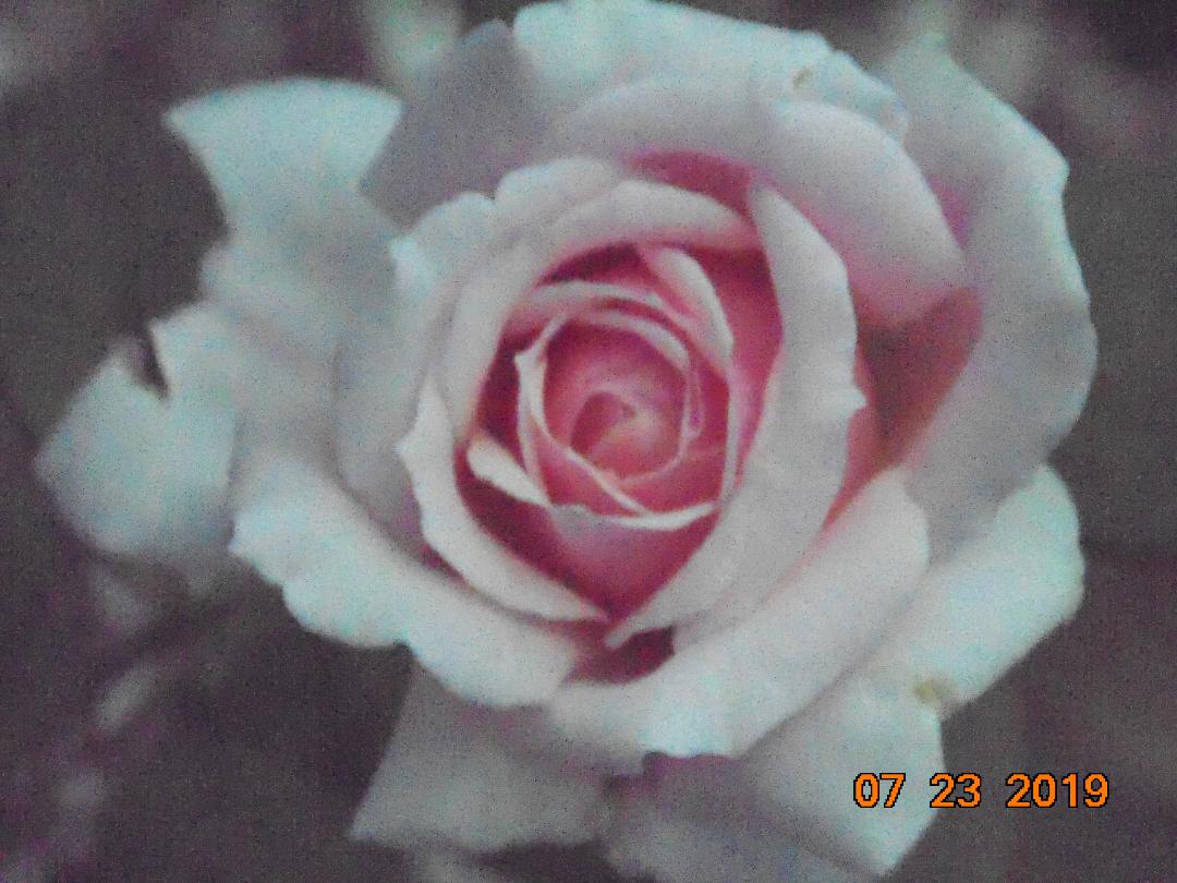
Soft, easy on the eye & pleasing to the nose


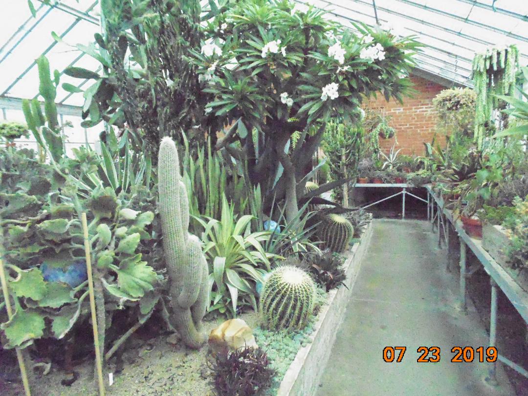
Before leaving-we went into the conservatory- large rooms with good variety of plants.

When I tour gardens I don’t really “study”- I hope these photos help you apply design elements in your own gardens. So get out there and explore—
Let’s all be inspired by those who have already done. gk

Leave a comment